
Brand Strategy
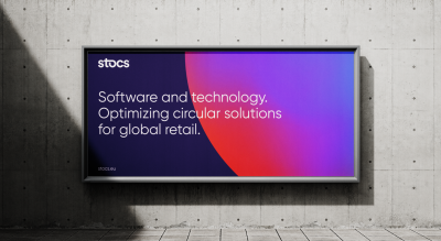
We began by redefining stocs brand strategy, emphasising their unique value proposition: “Rethink Reverse.” This unique position became the foundation for the entire project, signifying their disruptive approach to the circular economy.


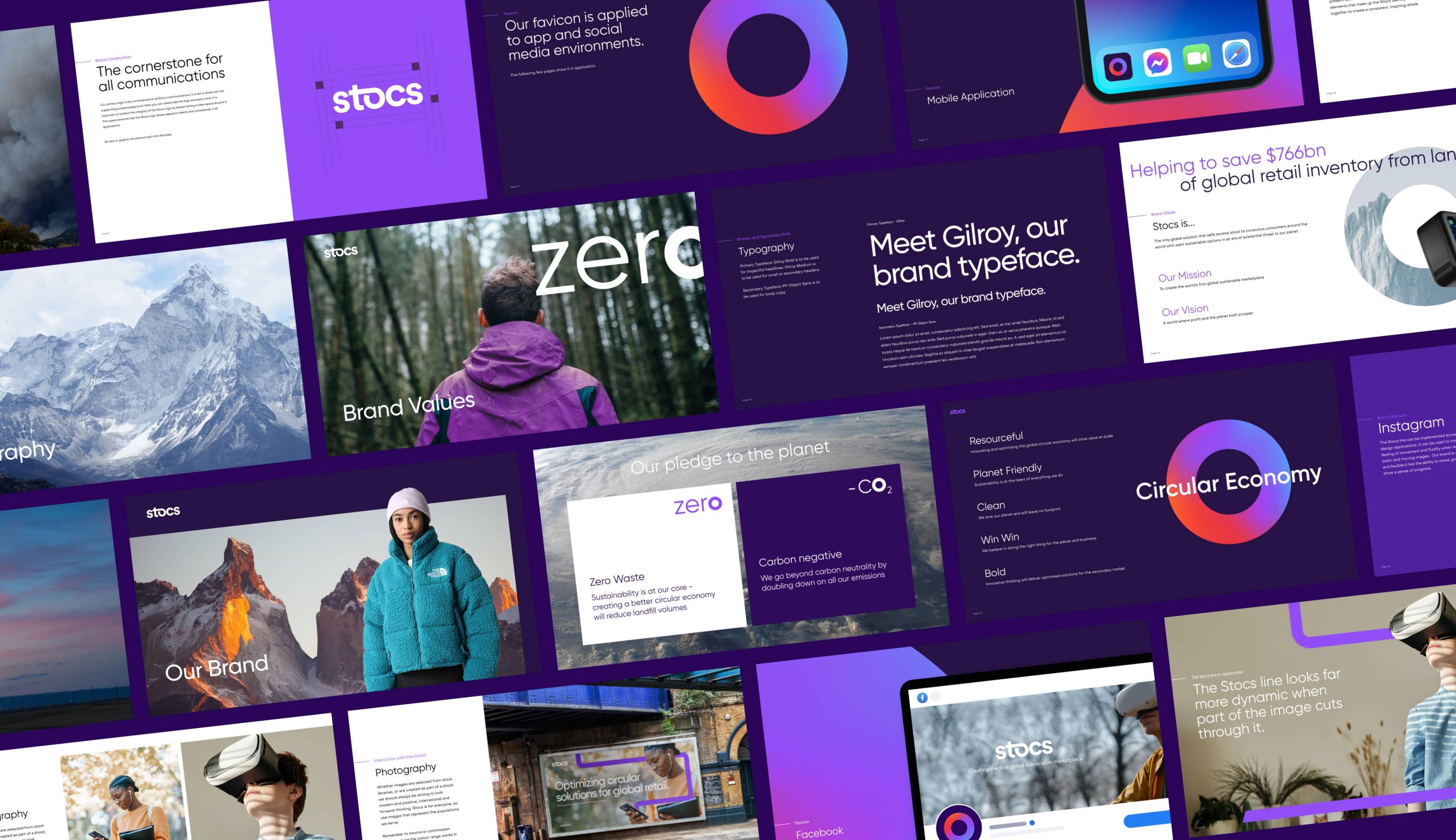
Favicon
The favicon is designed as a visual introduction and centrepiece for the digital environment. It incorporates the ‘O’ from the word ‘Stocs’ and the vibrant colour wheel represents all the strands of activity coming together to show a united and integrated front – to reflect the circular economy. This thinking neatly led us to to use the same letterform in key messages – see below.


Brand Identity
Our design team crafted a dynamic brand identity that blended bold, modern aesthetics with eco-friendly elements, highlighting stocs’ commitment to sustainability. The new logo represents a flow, symbolising the continuous movement of products.


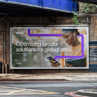
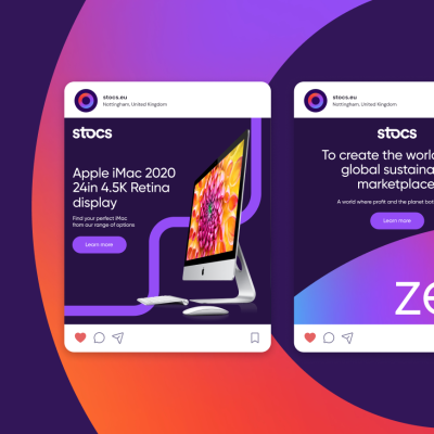
Brand Experience
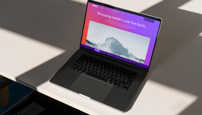
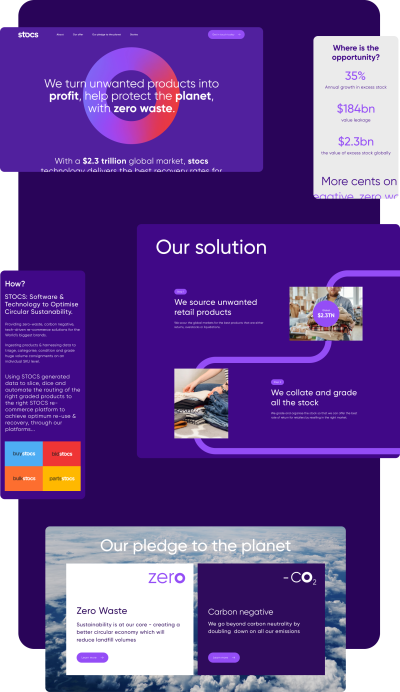
We extended the brand experience across multiple touch-points, including a user-friendly website, engaging webinars, informative podcasts, investor pitch decks, and visually captivating social media content.
Results
stocs is a compelling global platform that aligns with their mission to reshape reverse logistics. Our brand comms have garnered increased engagement, driving their message of sustainability and brand protection. With our help, stocs is leading the charge to ‘Rethink Reverse’ and keep the circular economy in motion.