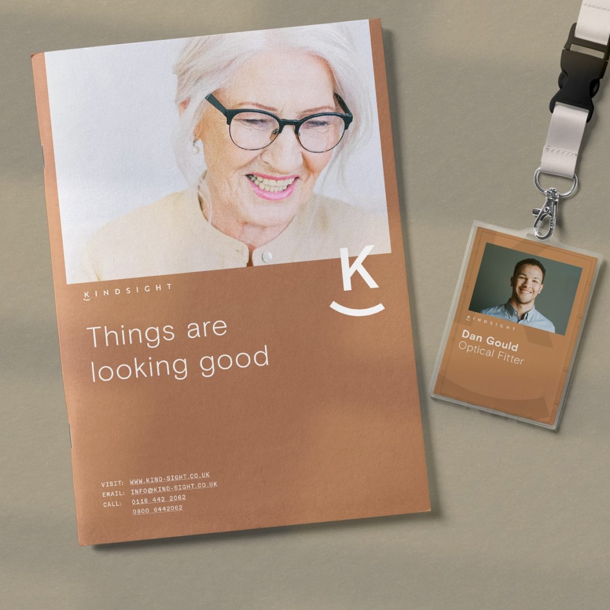
The Framework Design team began by running sessions with Kindsight to better understand their business, ethos, goals, and what makes them unique. From there, the team was able to produce a distinctive brand identity that stood out whilst also supporting Kindsight’s key company values of dignity and integrity.


Our designers produced a primary colour palette consisting of brown, blue, and green shades inspired by different eye colours. These can be used to create different versions of the same piece of stationery or packaging and then given to customers with the corresponding eye colour as a personal touch.


Additionally, the team created a clean and elegant logo that can also be shortened into a brand marque and used on social media posts or as a textured background on marketing materials.

Kindsight’s new branding helps them to stand out and provide a more personal experience for their customers. The soft colours, clear typography and positive imagery help to emphasise the friendliness and professionalism of the team.

With Kindsight having approved their new branding, we provided them with a set of guidelines so that they could easily distribute details of the brand to staff and any outside parties the business might work with in the future. The guidelines were provided as a pdf file to allow easier distribution and storage.

We are currently working on curating a video for Kindsight to showcase its services. Keep an eye out for updates here.


